Arsenal have announced that their kit manufacturing contract with Adidas has been extended until 2030, thus adding a further six years to terms that were originally set to expire in 2024.
The German brand first provided kits for the Gunners as long ago as 1986 as part of an original partnership that ran until 1994, when Nike took over the reins.
After five kit cycles with Puma between 2014-15 and 2018-19, Adidas then returned as Arsenal's official apparel supplier in a deal reported to be worth around £300 million at the time. Thanks to the latest extension, the brand will now remain in situ at the Emirates for the foreseeable future.
The collaboration has produced several instant classic kits over the years, but it's fair to say that not every effort has been a winner. Here's a look at the best and worst strips Adidas has created for the North Londoners.
- Stream on ESPN+: LaLiga, Bundesliga, MLS, more (U.S.)
Best kits
1. Home 1992-94
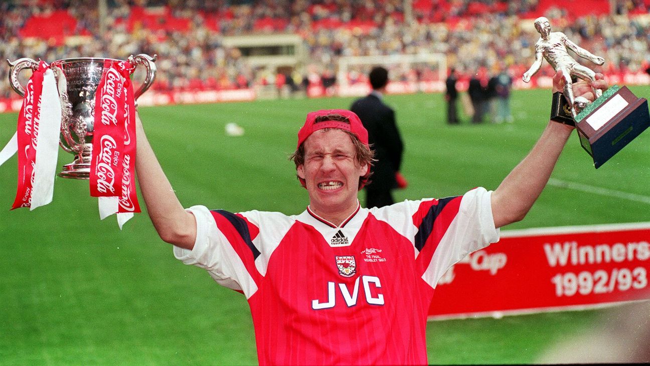
Forever synonymous with Arsenal's FA and League Cup double triumph under George Graham in 1992-93, the kit worn during both finals still shimmers with a nostalgic lustre. No Gunners home shirt has ever looked quite the same thanks to the blocky sleeve trim and the similarly unusual central positioning of the Adidas logo, which was both located centrally and incorporated into the oversized collar.
2. Away 1991-93
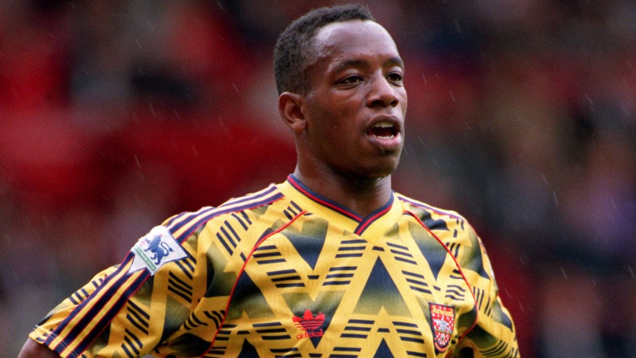
Arguably the most famous and fondly remembered Arsenal kit in the pantheon, the yellow and navy shirt (aka "The Bruised Banana") remains a fan favourite to this day. Far more aesthetically appealing than its colloquial nickname suggests, the design is an ever-present staple in any English league kit hall of fame.
3. Home 2019-20

After 25 years away, Adidas was under considerable pressure to get things right upon their grand return to the Arsenal fold. Sure enough, the maiden offering of their new kit deal was a smart home shirt that sparkled with subtle, traditional appointments -- including impeccable trim inspired by the 1990s Adidas strips worn over two decades prior.
4. Home 2020-21
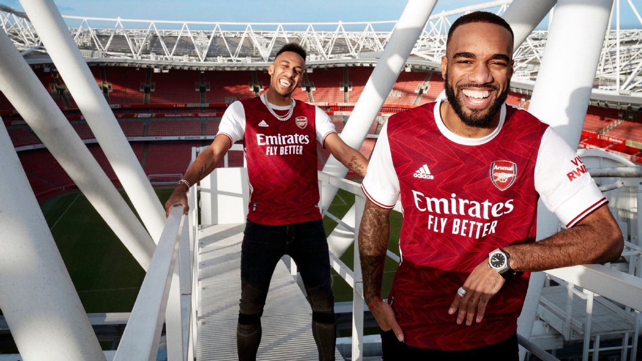
The smartest offering of the modern post-2019 home kits, Adidas got everything right here. The principle design inspiration came from the geometric Art Deco styling of the old Arsenal club crest from the 1930s and 1940s, while the triangular pattern used on the jersey was taken from the motif found in the floor tiling inside the famous "marble halls" of the old East Stand building at Highbury.
5. Third 2021-22
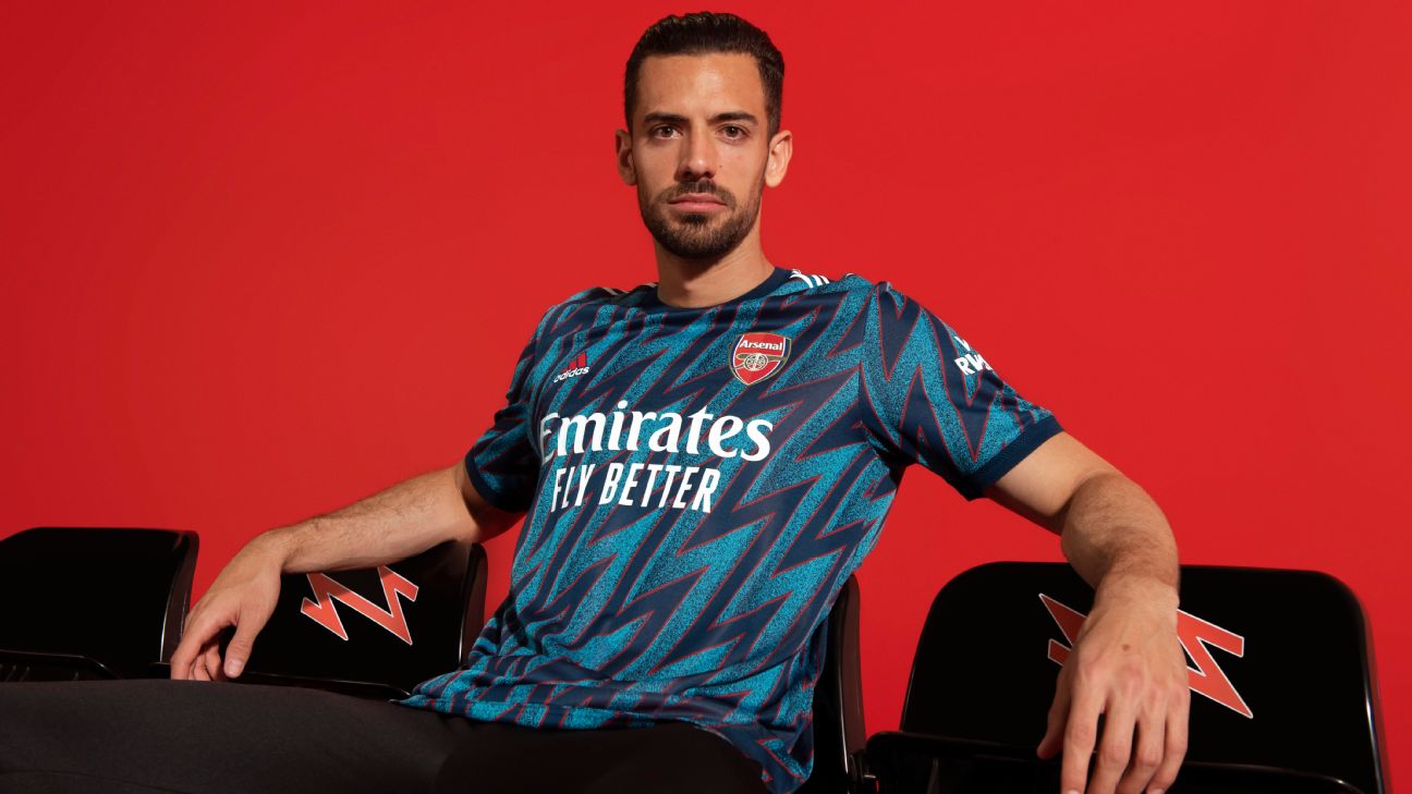
Using the Gunners' couplet of "blue lightning" away kits from 1994 and 1995 as a starting point, Adidas presented an updated take on the design by morphing the bolt into an all-over zig-zag pattern in dark blue and turquoise to create a perfect balance of contemporary and retro.
Worst kits
1 & 2. 1986-88 home and away
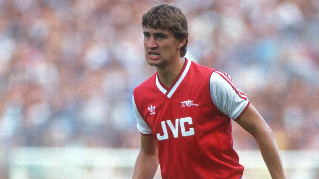
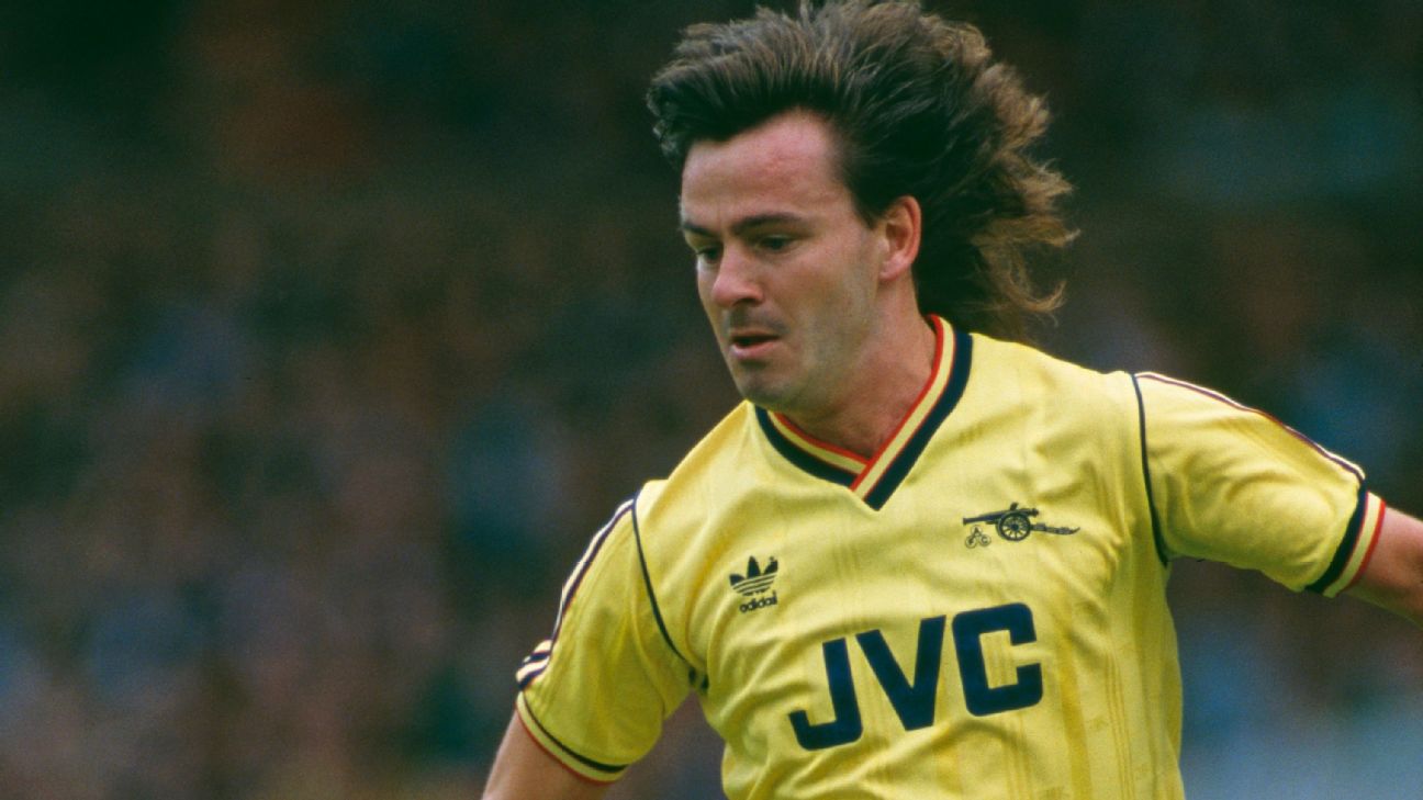
We'd just like to state up front that the first designs provided for Arsenal by Adidas are ostensibly perfectly fine. Indeed, both the home and away kits of the era look great from afar thanks to their vintage aura. The reason they are included on this list is the material they were made from -- that horrid, thin, overly shiny, static-prone, bobbly polyester that sticks to everything it comes within six inches of.
3. 2020-21 away

A kit that certainly spliced opinion in twain, the white shirt was flecked with "veins" that were supposed to imitate the red-hued marble found in the halls at Highbury. However, it also made the wearer look like they'd been involved in a particularly gory industrial accident.
4. 2021-22 pre-match
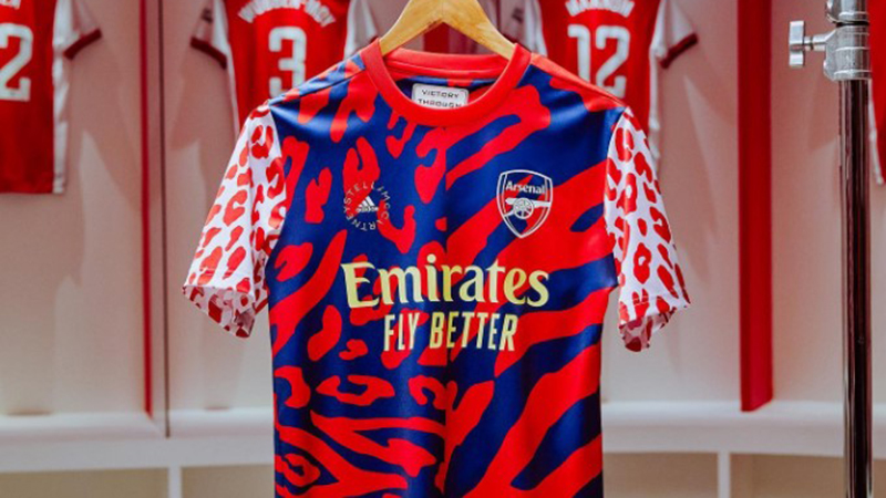
Created in conjunction with Arsenal Women and British fashion designer Stella McCartney, the result was a challenging patchwork of retina-pummelling animal print in garish, clashing colours. Hard to look at.
5. 2021-22 home
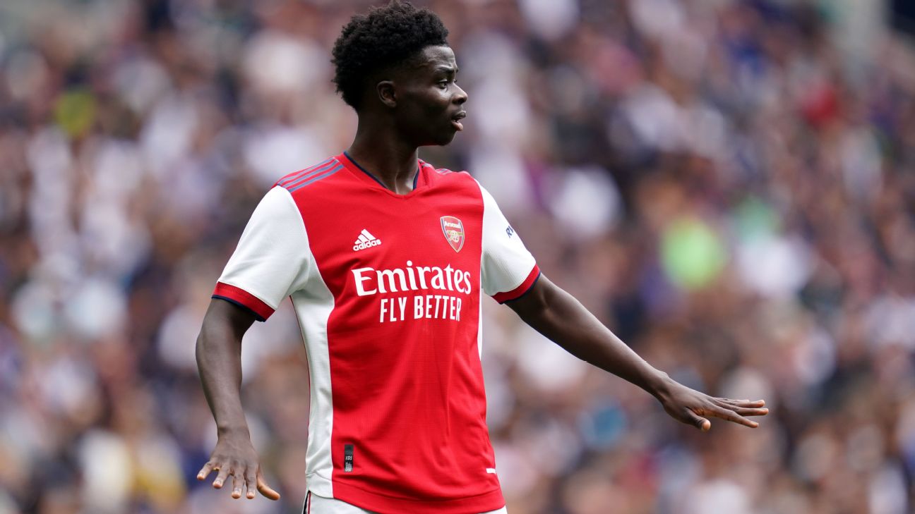
The weakest home kit from Adidas' second run as Arsenal kit manufacturers. The overall design was just a little too plain and understated, while the dark blue trim on the bright red shoulders just didn't stand out at all. Alas, it was all just a bit too forgettable.
