|
After compiling and ranking the best 101 soccer kits ever, it was only fair that we once again enlisted ESPN's soccer writers and editors from around the globe to help rank the worst designs ever to grace a football pitch. But 101 of them? Come on, no one deserves that, no matter how much you love to loathe them. So we've narrowed it down to 39, which is right on the limit of how many abhorrent designs we can handle in one place. In the ranking, we have taken into account kits from club and national teams and have considered their home, away and alternate third uniforms. - Stream ESPN FC Daily on ESPN+ (U.S. only)
- Don't have ESPN? Get instant access 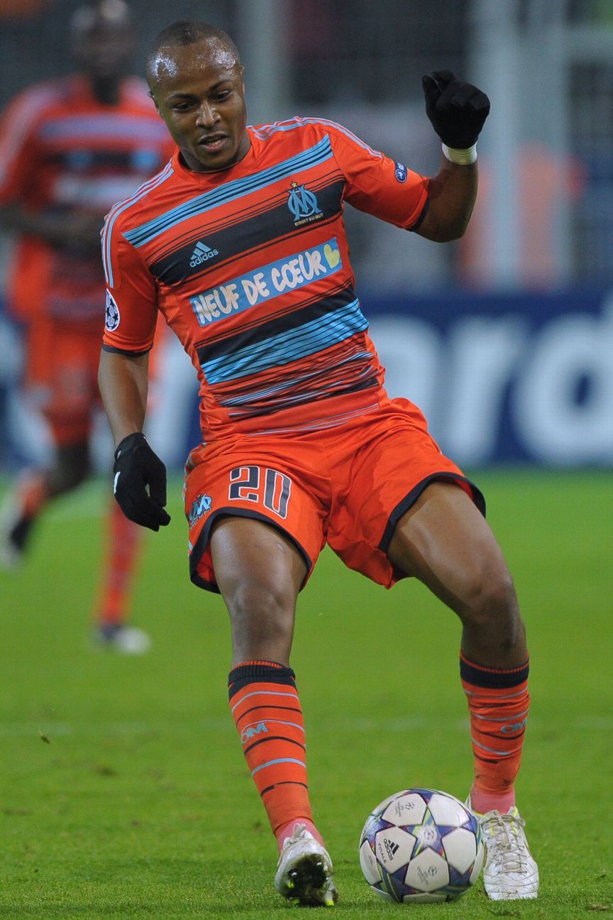 39. Marseille (third) 2011-12Marseille's motto, perched under the club crest, translates to "Straight to the point." So we'll get right to it here: this kit is awful. You know when your printer starts to run out of ink and the document ends up with hideous lines across it? Well, that's exactly what this orange-and-blue striped mess by Adidas looks like. They did reach the Champions League quarterfinals wearing this, though, so we'll call it even.
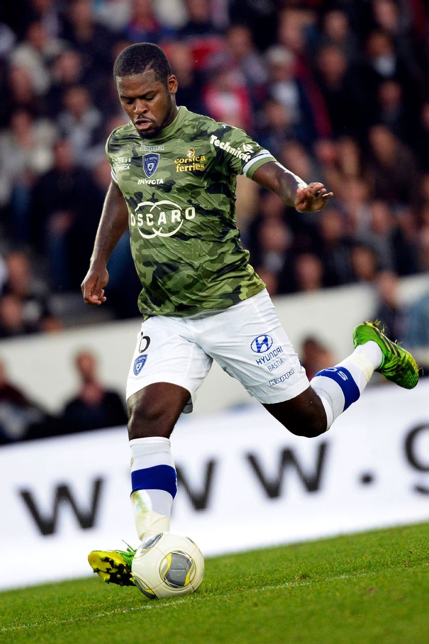 38. Bastia (third) 2013-14Wearing camouflage is always a bold choice and rarely pays off for anyone who isn't a hunter or an active member of the armed forces. The footballing gods clearly agree because the first time Bastia wore this kit was at Paris Saint-Germain, where they were beaten 4-0, with Zlatan Ibrahimovic scoring an iconic backheel volley and Edinson Cavani slinking through the defence and around the goalkeeper. Hardly surprising, as none of the Bastia players could see each other. Incredibly, Bastia's away kit the next season was also a camo design. Why won't people learn?
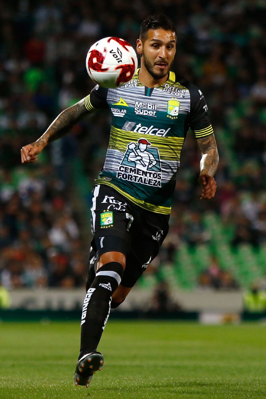 37. Leon (third) 2020Mexican sports brand Pirma designed a shirt that resembles the screen of a laptop after it crashes under the weight of too many spam pop-ups. The disastrous pattern has not one, not two, but five sponsor logos on the front, including the pièce de résistance -- a huge ad featuring a construction worker across the stomach for a cement company.
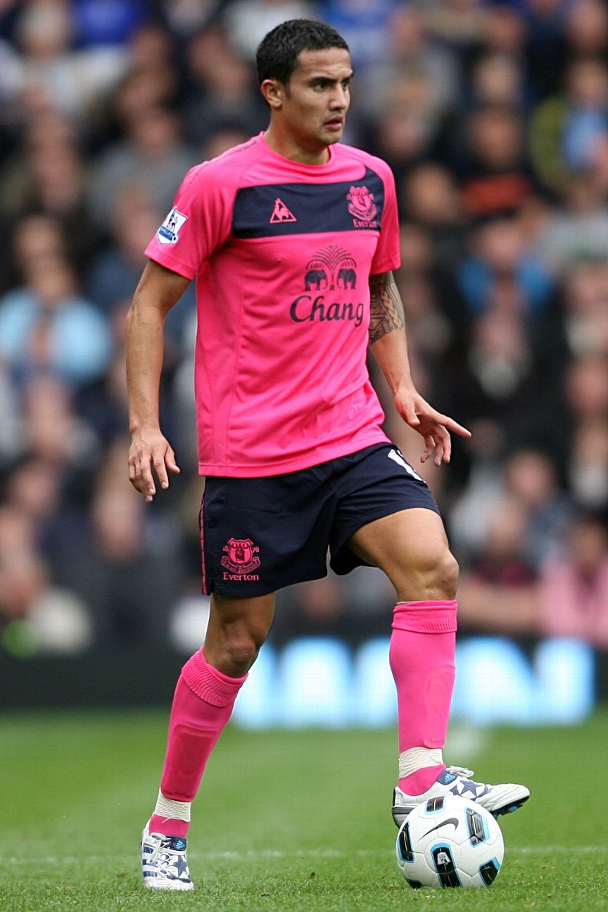 36. Everton (away) 2010-11The colour of this kit, described as "lightning pink" by manufacturer Le Coq Sportif, was meant to make the players more visible to each other. It was also inspired by the club's kit from the 1890-91 season, when the Toffees won their first of nine league titles. Midfielder Leon Osman admitted it "caused a bit of a stir in the dressing room" and was a "brave" design, while the club's chief executive Robert Elstone said at the time: "We want this new kit to help take Everton to the next level." They won four away games that season.
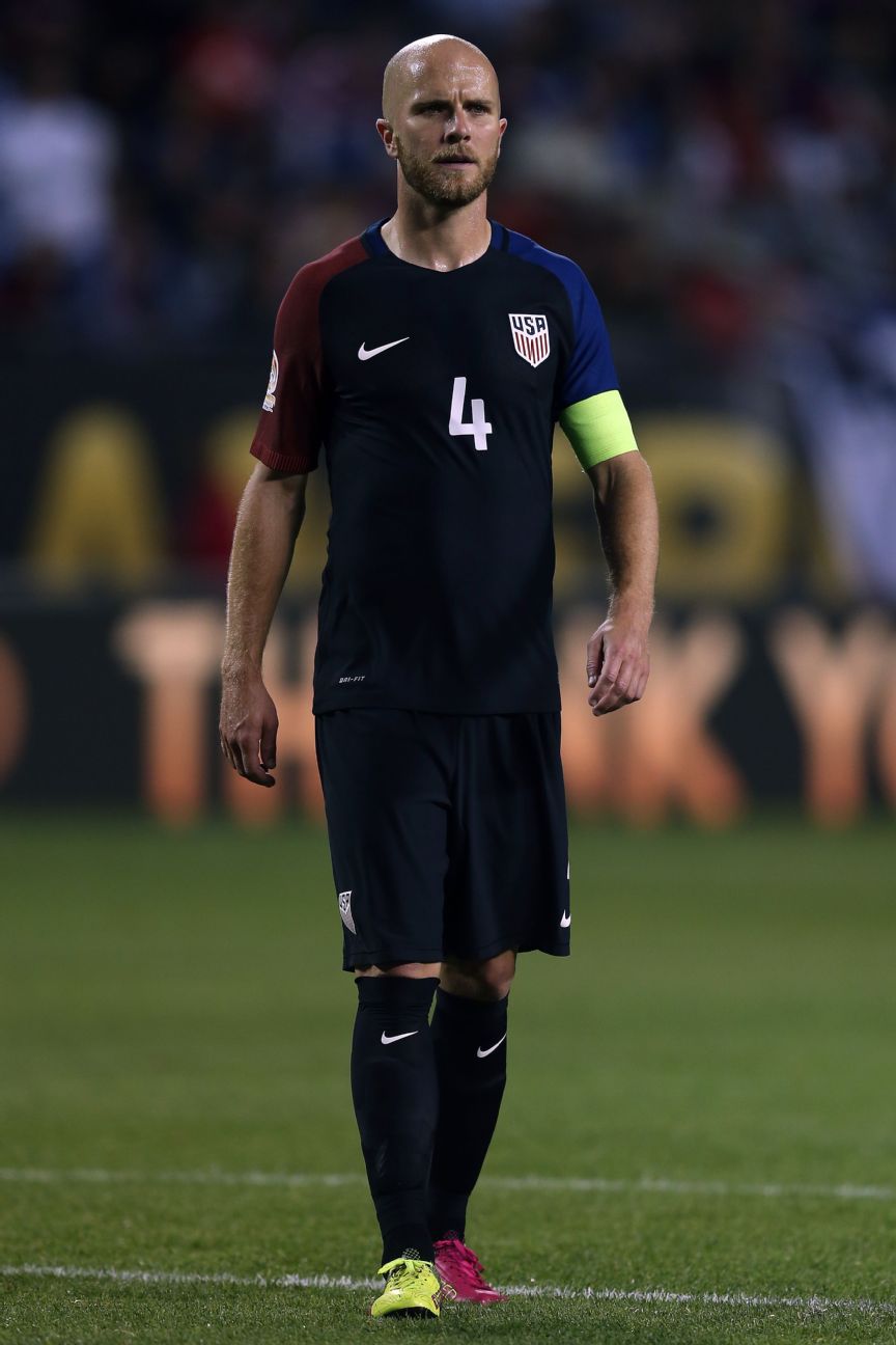 35. United States (away) 2016The red-and-blue shoulders against a black template on this kit, released for the Copa America Centenario tournament, was something of a departure from the predominantly blue or red kits the United States usually wore for their road colours. The U.S. hosted the tournament and finished in fourth place ahead of some South American heavyweights, but this kit was never worn again.
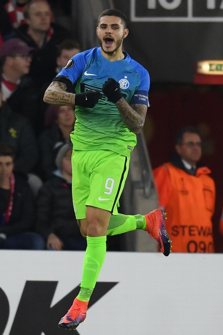 34. Inter Milan (third) 2016-17Someone at Nike loves a gradient effect almost as much as they love colours with names like "electric green," which sounds like a scuzzy Los Angeles rock club. This kit is as much a cry for help as anything else, but it is not even the worst Nike gradient design on this list (stay tuned). It's almost fitting that Inter had one of their worst seasons in recent memory in this kit, finishing seventh in Serie A, exiting the Europa League in the group stage and going through three managers in the process.
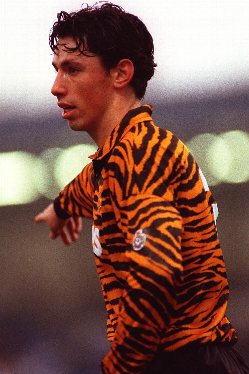 33. Hull City (home) 1992-93Hull City have been desperate for you to call them the Tigers for some time. Long before owner Assem Allam declared he would stop investing in the team after the FA blocked his attempt to rename the club "Hull City Tigers" in 2014, we had this eye-watering garment from manufacturers Matchwinner that would make the Tiger King, Joe Exotic, jealous. Incredibly, Umbro flirted with this design for the 2019-20 season with tiger stripes across the top of Hull's shirts. Fittingly, they finished bottom of the Championship.
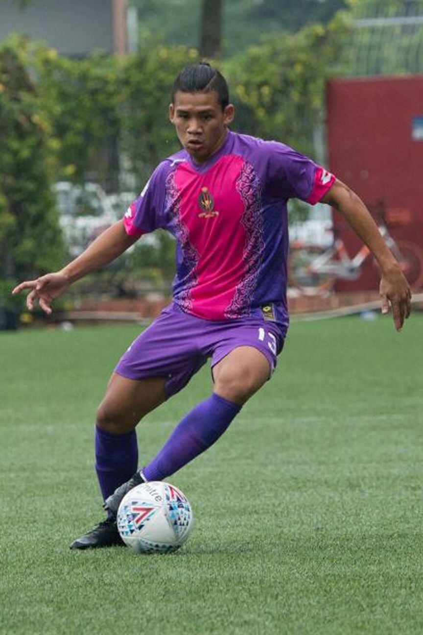 32. Brunei DPMM (away) 2018Pink and purple is a bold look that few would try to pull off. The club had previously dabbled with the colour combination as an away strip in 2014 but decided to really up the stakes for the Singapore Cup two years ago by having manufacturers Lotto slap the pink in the middle of the purple and adding a floral trim. They reached the final of the competition that year, presumably because the kit distracted their opponents.
31. Necaxa (third) 2000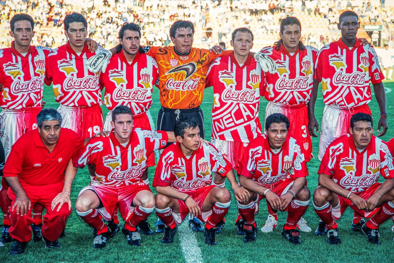 Mexican sports brand Eescord threw everything they had at this kit, including a super-sized club badge and name across the torso. They also worked two images of their own star logo into the design. And then in case you weren't totally sure, they put the team's nickname "Rayos" ("Lightning") on the other shoulder.
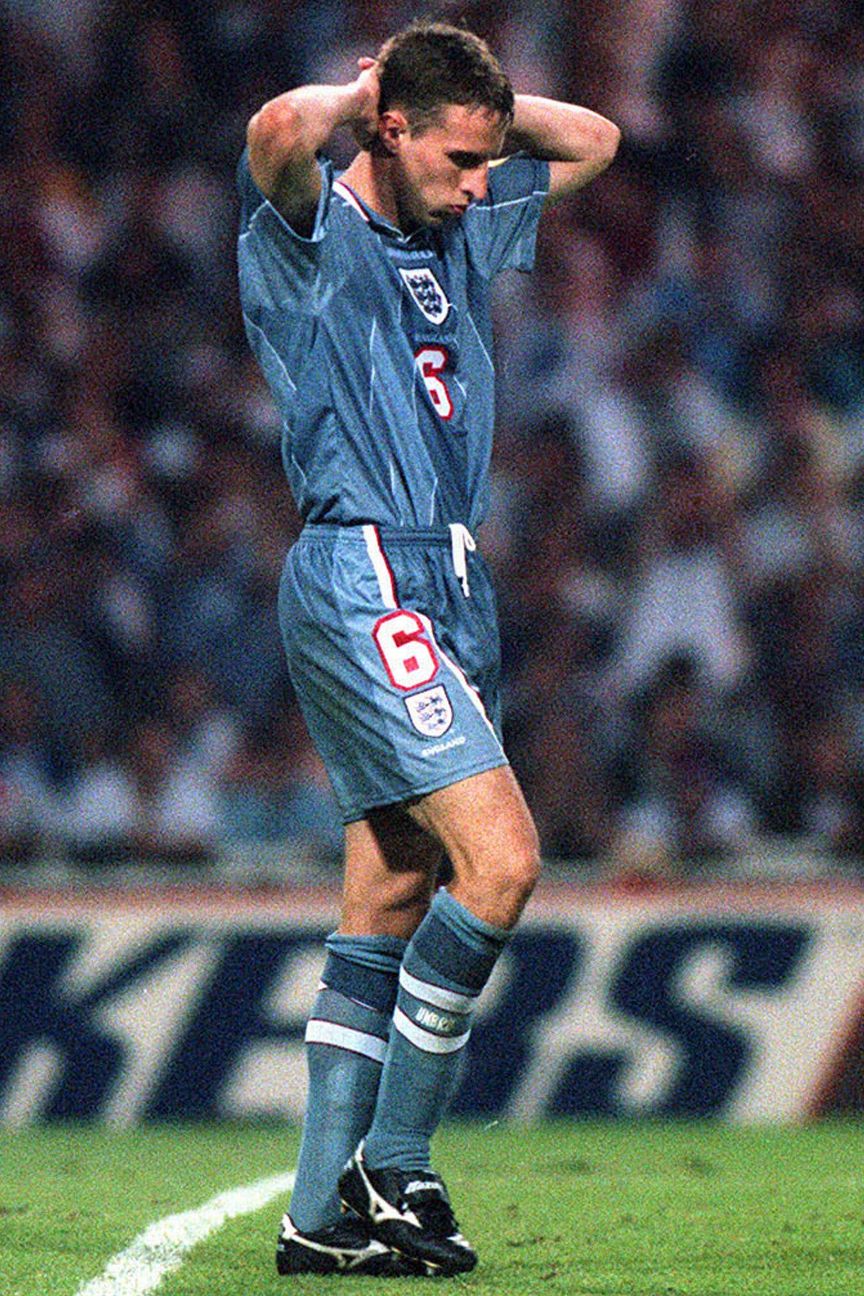 30. England (away) 1996Rarely has one player defined a kit as much as Gareth Southgate, dressed in grey with hands on head after his miss against Germany in a penalty shootout that led to the Three Lions exiting the Euro '96 semifinals on home soil. This remains the only time England have ever worn "indigo blue," as manufacturers Umbro dubbed it at the time, in a change from the traditional red away kit. The colour was chosen to go well with jeans, but it didn't work at all in its primary purpose as a football kit.
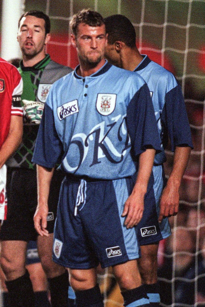 29. Stoke City (away) 1996-97In the 1990s, Stoke City must have been anxious to ensure that everyone who saw them play would remember them. Why else would manufacturers Asics emblazon "STOKE" in giant, shadowed font akin to an early Windows screensaver right across the torso? Unfortunately, the lettering was so massive that it was hard to see the whole word all at once.
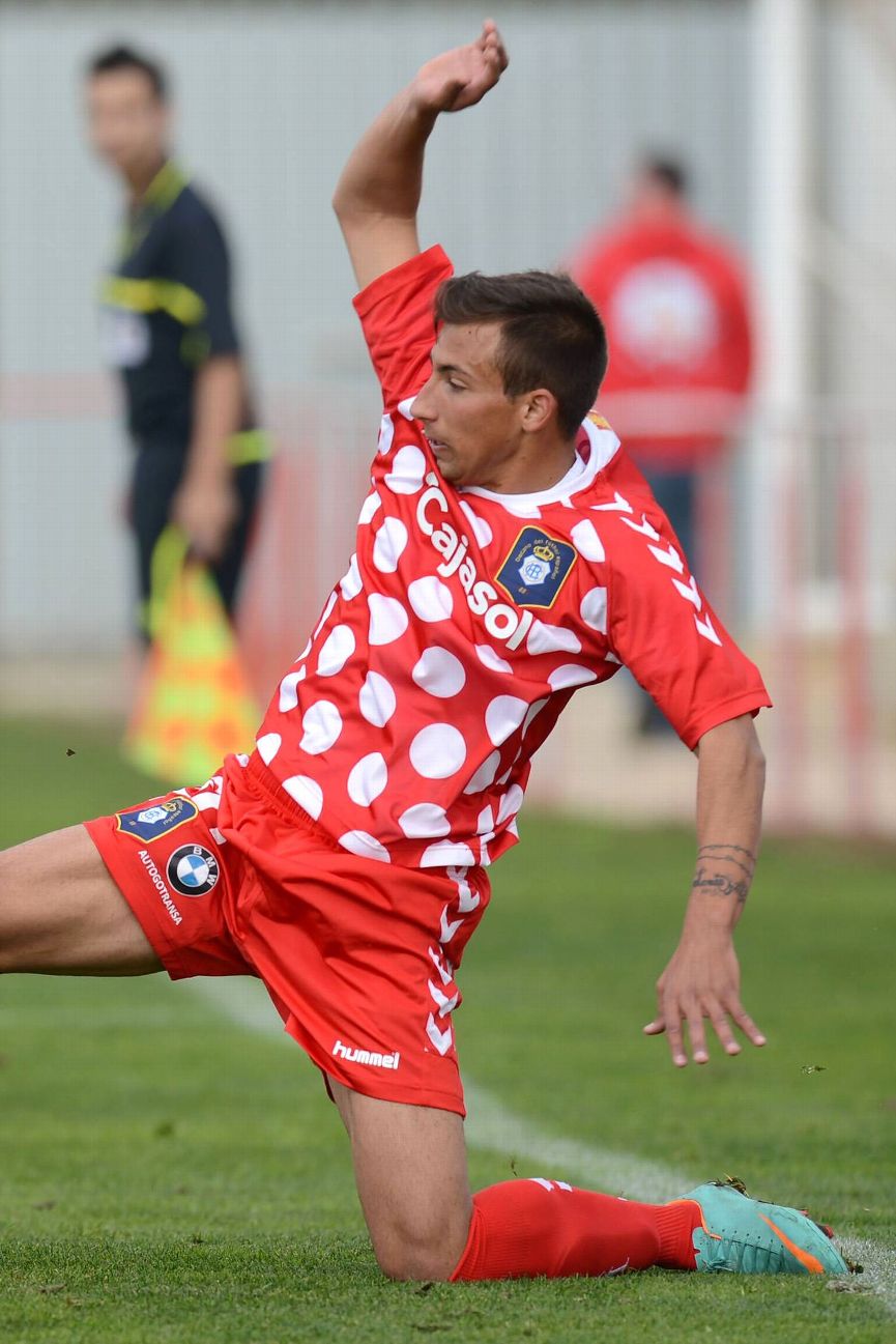 28. Recreativo Huelva (away)You'd be forgiven for thinking that manufacturers Hummel were huge fans of Minnie Mouse, judging by this kit. They made it for Recreativo Huelva, who, founded in 1889, are Spain's oldest club. But the truth is this: Hummel insisted they had only two weeks to put together both the home and away uniforms. Recre's fans responded to the rush job by taking to the streets in protest to implore the club to change the design, only to be met with an official response from the club that they found the kit to be "innovative."
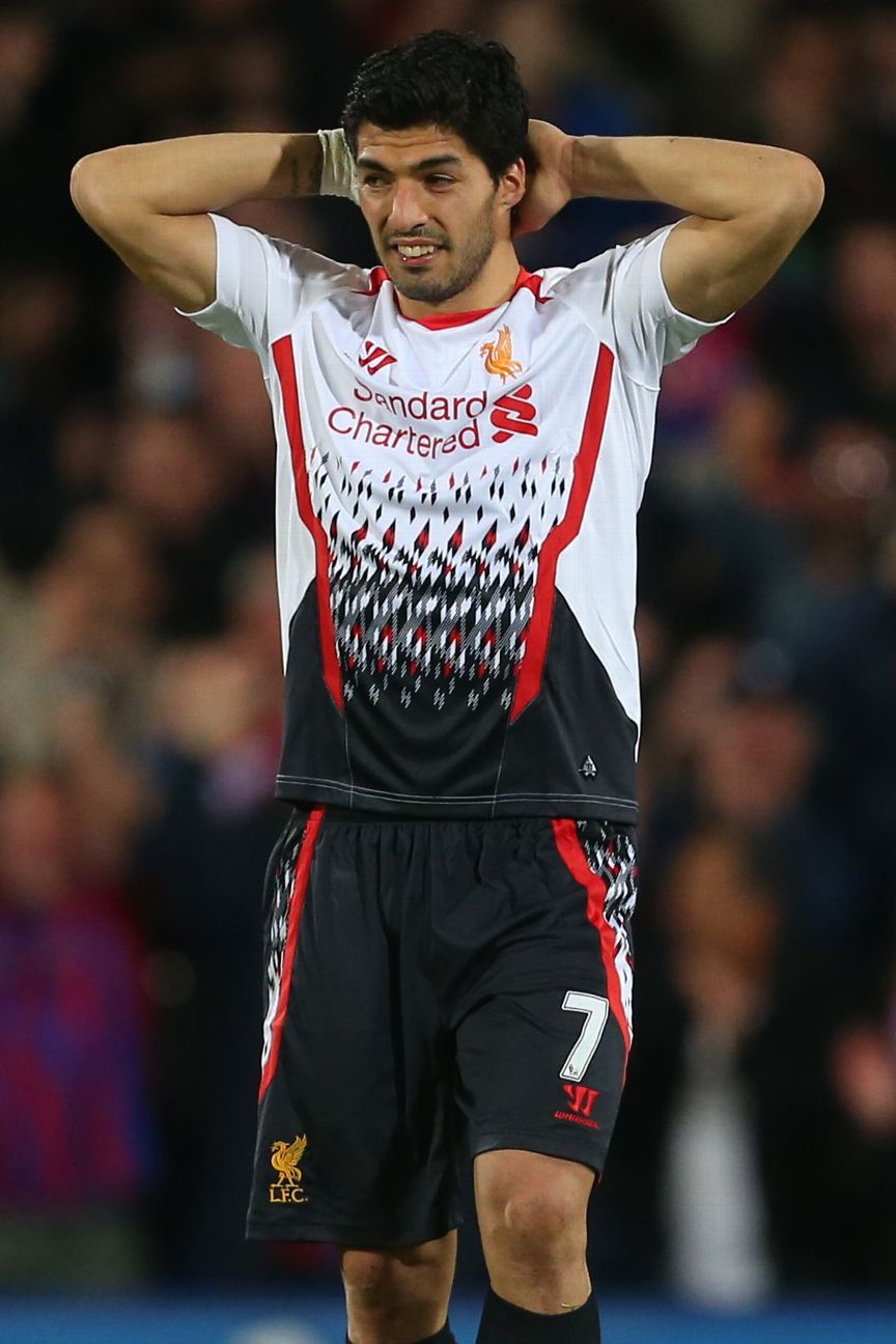 27. Liverpool (away) 2013-14The 2013-14 season was a bad one for the Reds: not only did they throw away their best shot at a first title in 24 years but they did so in this horrendous away kit. In their next match after Steven Gerrard's infamous slip in a home defeat to Chelsea, Liverpool wore this shirt during the infamous "Crystanbul" game at Crystal Palace, when they lost a three-goal lead and, with it, their hopes of winning the title. This jersey, featuring a diamond print that manufacturers Warrior called "a refreshed interpretation of the graphics featured in the 1989-91 away strip," was unveiled with the cringeworthy hashtag "#RiseUpLFC," which includes all the letters you need to make "#USlipFC." No one tell Gerrard.
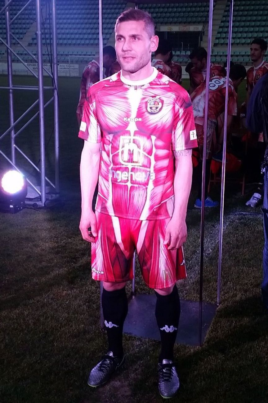 26. CD Palencia (home) 2016-17The first of several outlandish novelty concept kits in this ranking, with Spanish lower-league team CD Palencia suiting up like figures in a medical school textbook. This outfit was chosen to show the players were willing to "give their skin" for the cause. It was created by Juan Francisco Martin who, as we will see later on here, is a specialist in the area of strange Spanish kits. Palencia won the playoffs to earn promotion to the third tier, so it had the desired effect.
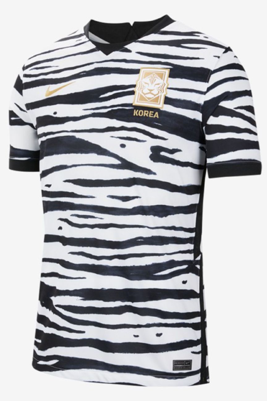 25. South Korea (away) 2020When the South Korean Football Federation released an updated badge with a sleek new tiger logo, they needed a kit to match. Or so they thought -- those of us who witnessed Hull City's 1992 kit (No. 33) know that's a terrible idea. What the Korean team got in the end was a shirt that looked like something "101 Dalmatians" villain Cruella de Vil would wear. The kit was released earlier this year and hasn't been worn yet.
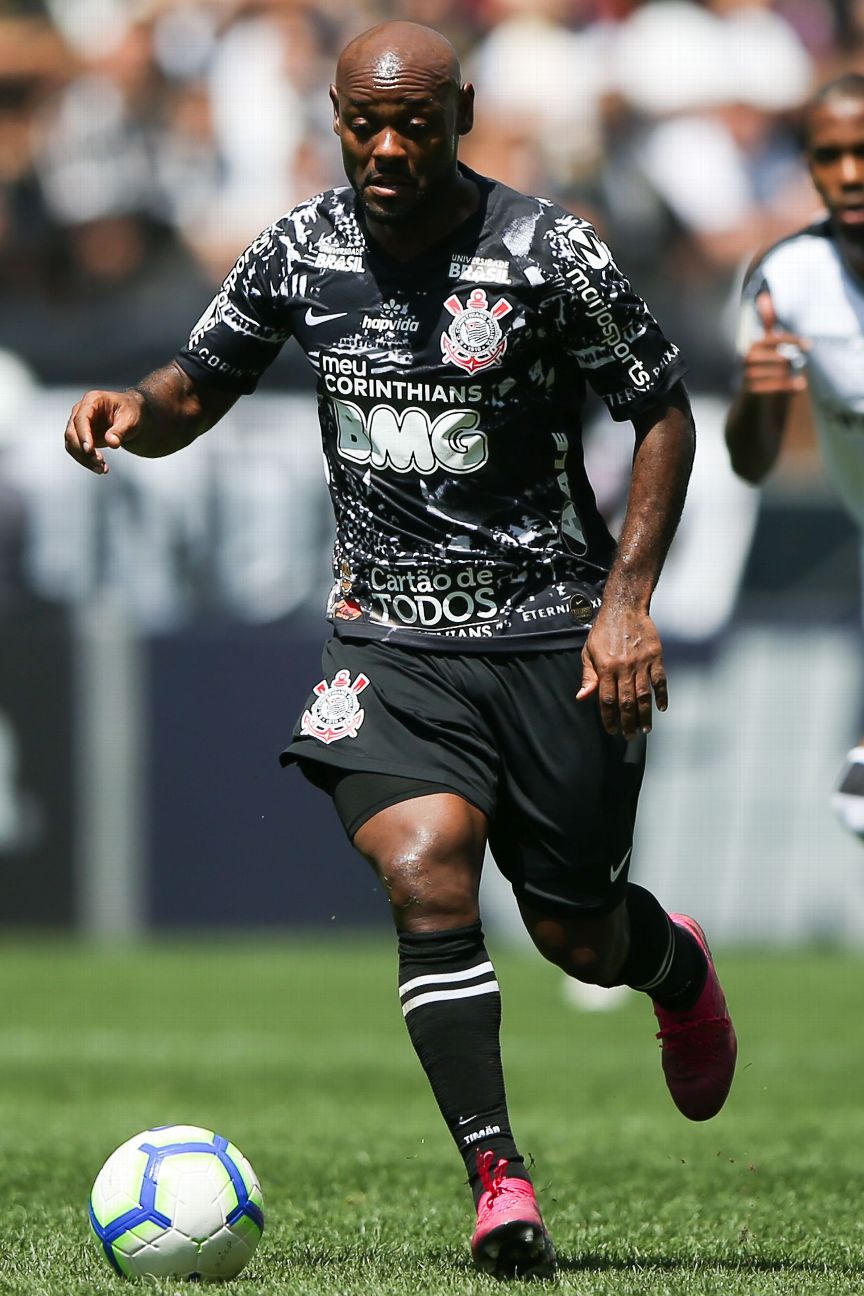 24. Corinthians (third) 2019-20Would you buy your team's shirt if there was a chance you might spot yourself on it? Of course you would. Well, that was the angle Corinthians were going for this season with their third alternate kit. It superimposed images of times their fans "invaded" other towns before big games: "A Invasão Corinthiana" ("The Corinthians Invasion") during the 1976 Brazil Championship finals against Fluminense at the Maracana and during the 2000 and 2012 FIFA Club World Cups. The result? Uninspiring splotches.
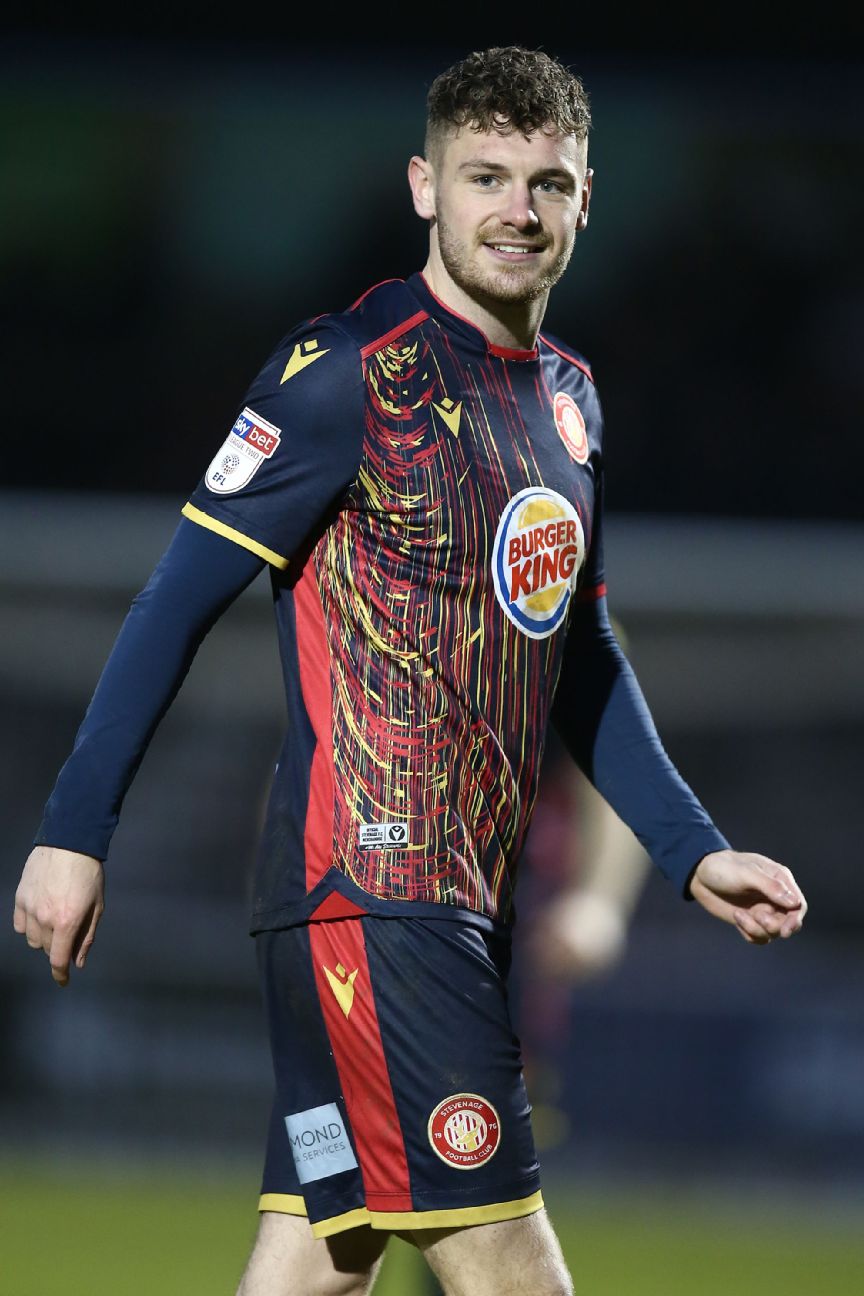 23. Stevenage (away) 2019-20With English lower-league club Stevenage sponsored by fast food giant Burger King, kit manufacturers Macron's design matches perfectly -- it looks like the aftermath of an accident with sachets of mustard and ketchup after a trip to the drive-thru. While we're on the subject of the home of the Whopper, a special nod is due to Getafe. The Spanish club had a perfectly fine kit ruined in 2009 by Burger King not just having their logo on the front but also the face of the Burger King himself on the inside. The idea was that the players would celebrate goals with the jersey over their head, Fabrizio Ravanelli-style. Madness.
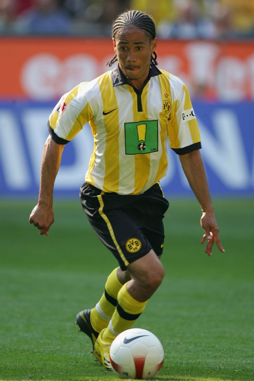 22. Borussia Dortmund (home) 2006-07Most clubs are synonymous with certain colours in the eyes of their fans, and for Dortmund supporters, the players have to be wearing black and yellow when they play in front of the fans in the Sudtribune. Except, that is, in 2006 when Nike unceremoniously changed the home colours to yellow-and-white stripes. The fans railed against it, so much so that a new rule was written into the club statutes ensuring the team's colours would be black and yellow forevermore.
21. Cultural Leonesa (home & away) 2015-16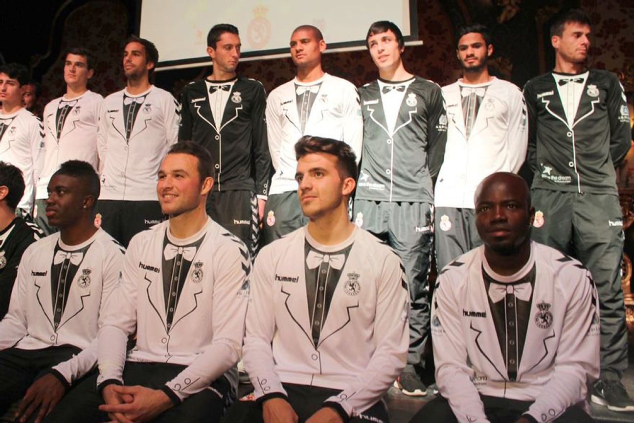 Juan Francisco Martin, designer of CD Palencia's kit (No. 26) is back again with another lower-league Spanish special. This was Cultural y Deportiva Leonesa's second tuxedo-themed kit in two years, with this 2015-16 effort adding extra details like cuff buttons to the previous season's design. It made the team look like a squad of butlers, but the fact that a percentage of shirt sales went to Save the Dream -- an organisation committed to empowering young athletes -- gives this seemingly frivolous kit some gravitas.
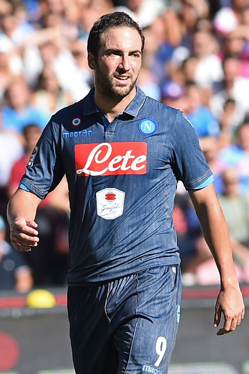 20. Napoli (away) 2014-15There are some places where wearing double denim is acceptable: on a ranch (if you're a cattle farmer), at the 2001 MTV VMAs (if you're Britney and Justin), on stage (if you're David Brent in "Life on the Road" -- in which case, "always double denim"). But it's totally unacceptable on the football pitch. Napoli broke this cardinal fashion rule when they allowed Macron (them again) to create this denim-look shirt and shorts combo. The fact Napoli dubbed the kit "Perfect Denim" when they launched it in 2014 would understandably lead you to think it was all a Brent-sized joke.
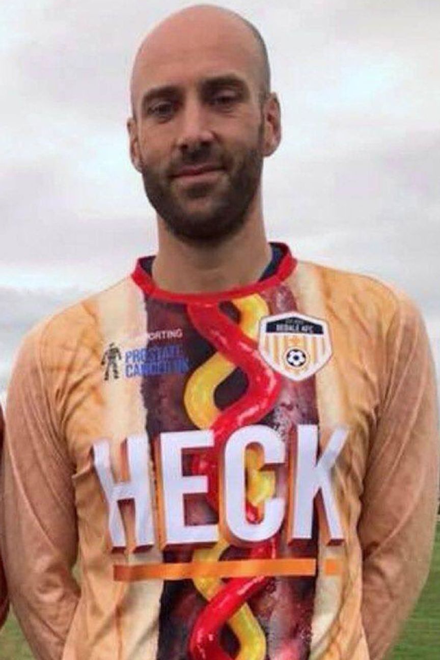 19. AFC Bedale (home) 2018-19English lower-league side Bedale are no strangers to a novelty outfit. From 2017 to 2019, they have released sausage-related kits, but we think this might be their wurst. Inspired by their sponsors, local meat brand Heck, Bedale seized the opportunity to get everyone talking about their kits. A percentage of every sale goes to Prostate Cancer UK, so we have to applaud the effort.
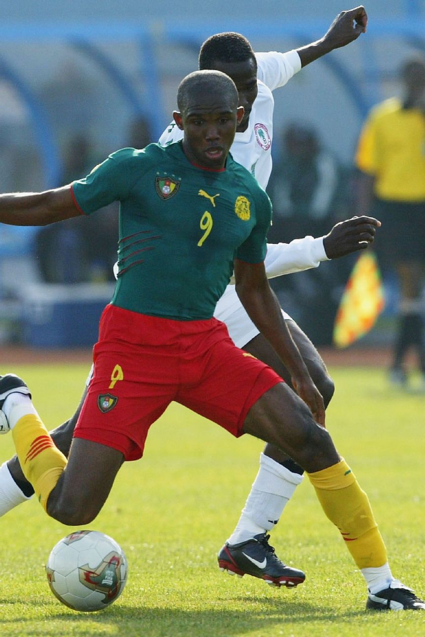 18. Cameroon (home) 2004When Puma decked out the Cameroon national team for their 2004 Africa Cup of Nations campaign in what was essentially a footballing version of a unitard, with a shirt and shorts stitched together, the question wasn't one of how but why? There's no obvious reason to do so except to antagonise FIFA, which -- coming two years after The Indomitable Lions had their wrists slapped for sporting basketball-style sleeveless shirts -- is exactly what it did. Sepp Blatter & Co. fined Cameroon $154,000 and docked six points from their 2006 World Cup qualifying campaign, asserting that FIFA rules required jersey and shorts to be separate garments. Both punishments were rescinded on appeal.
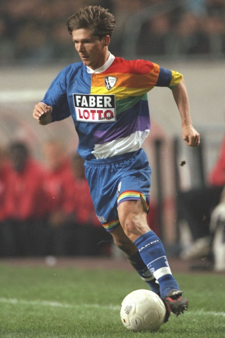 17. VfL Bochum (home) 1997-98Ever heard the phrase "if you want something done well, you have to do it yourself"? That's what German gambling company Faber Lotto-Service did with local team Bochum in 1997. Not satisfied with Reebok's and Reusch's timid designs, and with zero experience of making kits, Faber posed as a sports manufacturer and created their own colourful shirts for Bochum's first foray into the UEFA Cup. The fans absolutely hated Faber's rainbow logo, and the collective anger when the shirt was unveiled in front of them was audible.
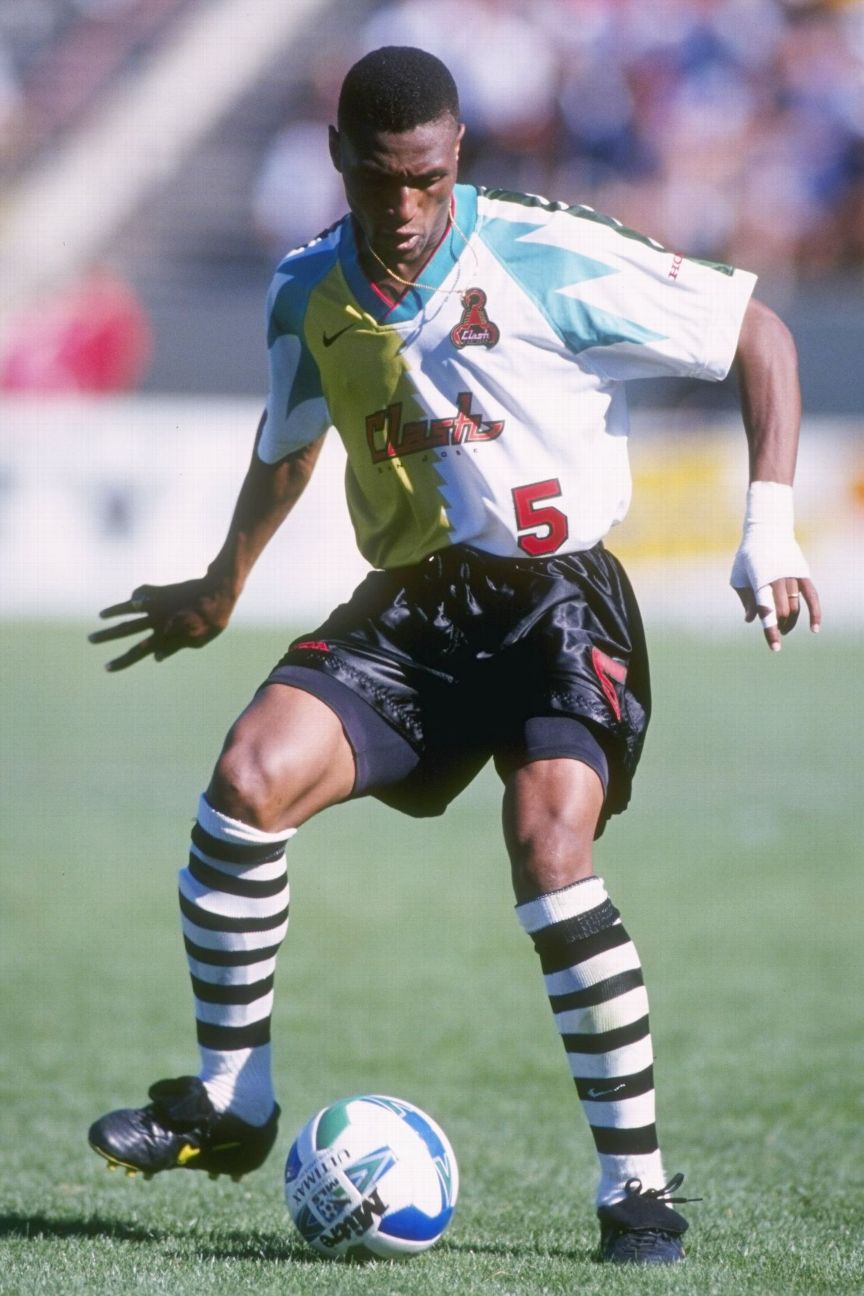 16. San Jose Clash (home) 1996This is first of two kits on this list from the inaugural MLS season (when, if we're honest, every shirt was a stinker) but this strip was one of the worst. It's actually a template that Nike rather lazily used twice more, for the NY/NJ MetroStars and LA Galaxy, but with much more respectable colour combinations than yellow and teal (the Clash's away kit featured what Nike described as "celery green"). The black shorts and hooped socks only add to the madness.
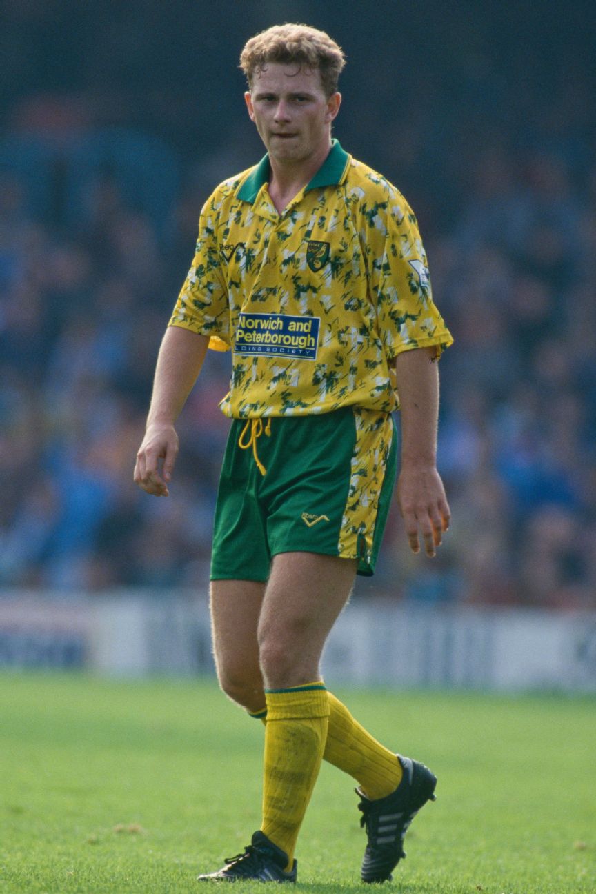 15. Norwich City (home) 1992-94You know a team's outfit is bad when fans dub it the "bird poo" kit. That's how Norwich fans still refer to this Ribero-manufactured jersey, even though the Canaries wore it during a successful spell. They finished third in the inaugural season of the Premier League, enjoyed a first foray into the UEFA Cup and even notched a victory over German giants Bayern Munich. Norwich actually released a white version shirt in 2016-17 as a third alternate, produced by Errea, which was an homage to the original. Norwich wore it twice.
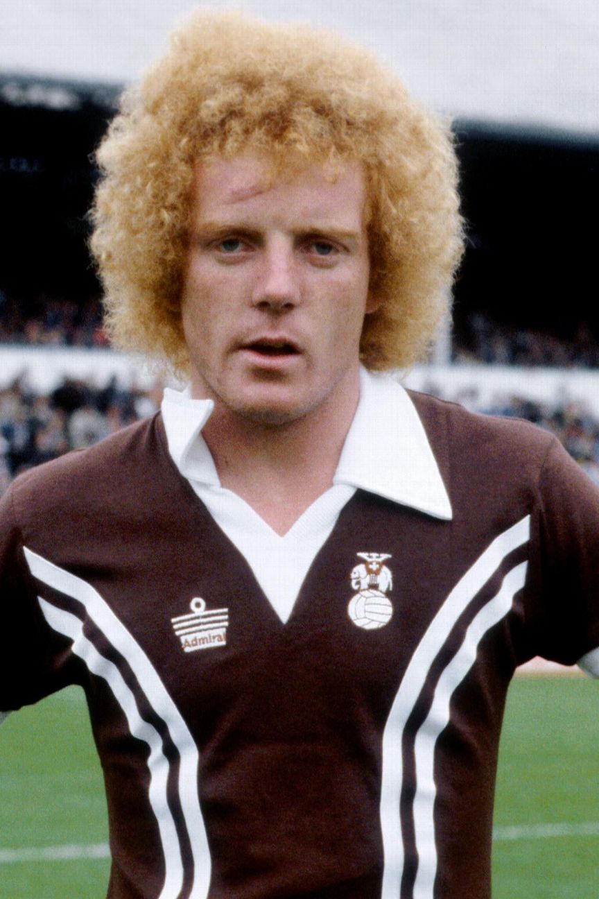 14. Coventry City (away) 1978-81In our 101 Best Kits ranking, we mentioned Admiral, the small Leicestershire-based kit manufacturers who went from making underwear in the 1900s to England's World Cup kit in 1982. Admiral really changed the game for football jerseys, introducing the idea of mass-produced replica shirts for fans and using unusual designs. Unfortunately, they didn't always get it right, and this was probably their worst. History credits much-loved Coventry kit man Jimmy Herbert as the brains behind this chocolate-coloured kit.
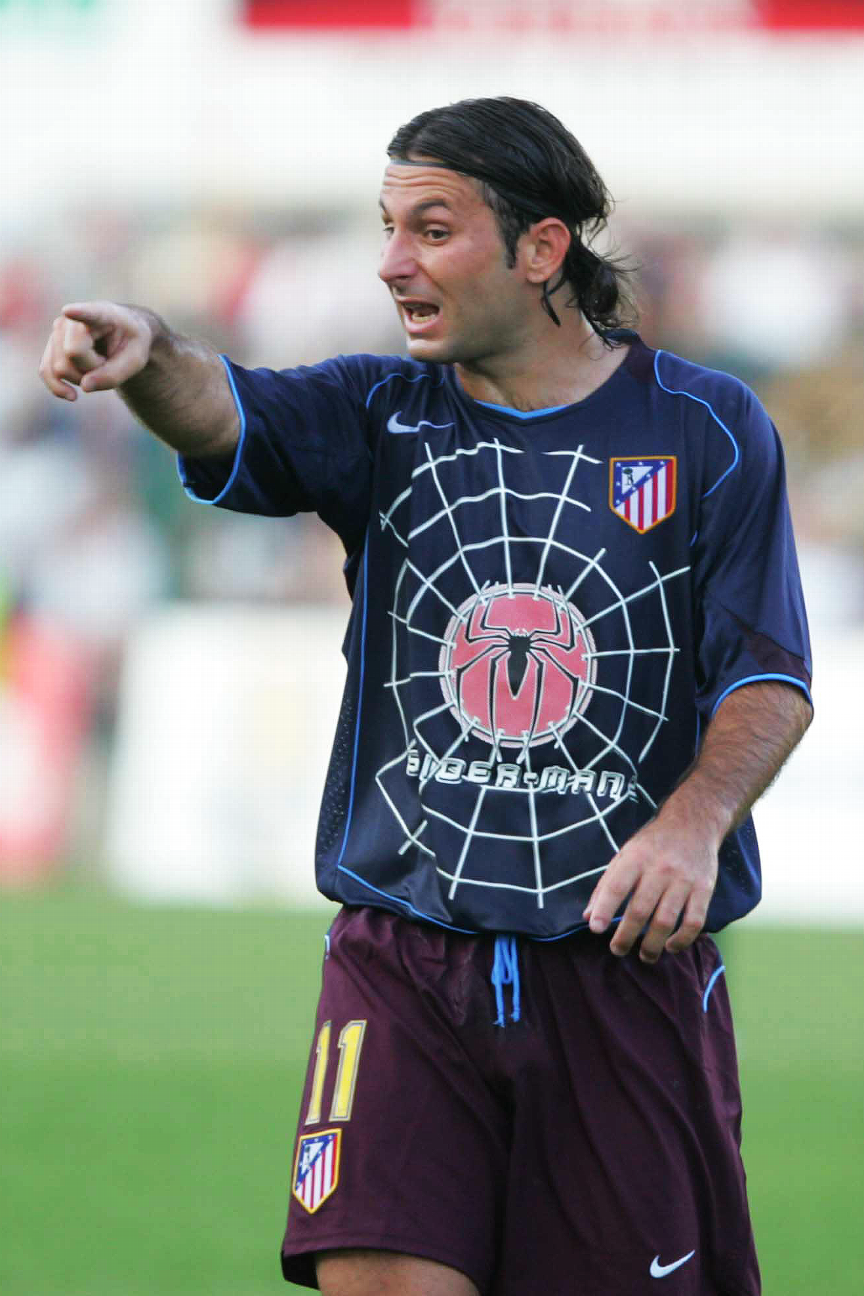 13. Atletico Madrid (away) 2003-04When Peter Parker was bitten by a radioactive spider he turned into Spider-Man. When Atletico Madrid were bitten by the Columbia Pictures bug in 2003 they turned their kit into this mess, complete with giant spider logo and web covering the entire front of the jersey. The deal with the Hollywood studio required the shirt sponsor to change from match to match whenever there was a new movie to promote. In that context, "Spider-Man 2" stands up pretty well compared with other titles, such as "White Chicks," "Hitch" and "Anaconda," that Atletico's players helped to publicise.
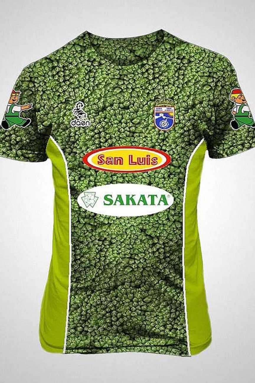 12. La Hoya Lorca (away) 2013-14We will give Spanish second-division side La Hoya Lorca credit for doing something parents have been trying to do for years: get kids interested in broccoli. They chose the divisive vegetable on account of it being the region of Murcia's most successful export. This was actually their second broccoli-themed shirt, after winning the third division title in one the year before. As a result the team was dubbed "El Brócoli Mecánico" ("The Clockwork Broccoli").
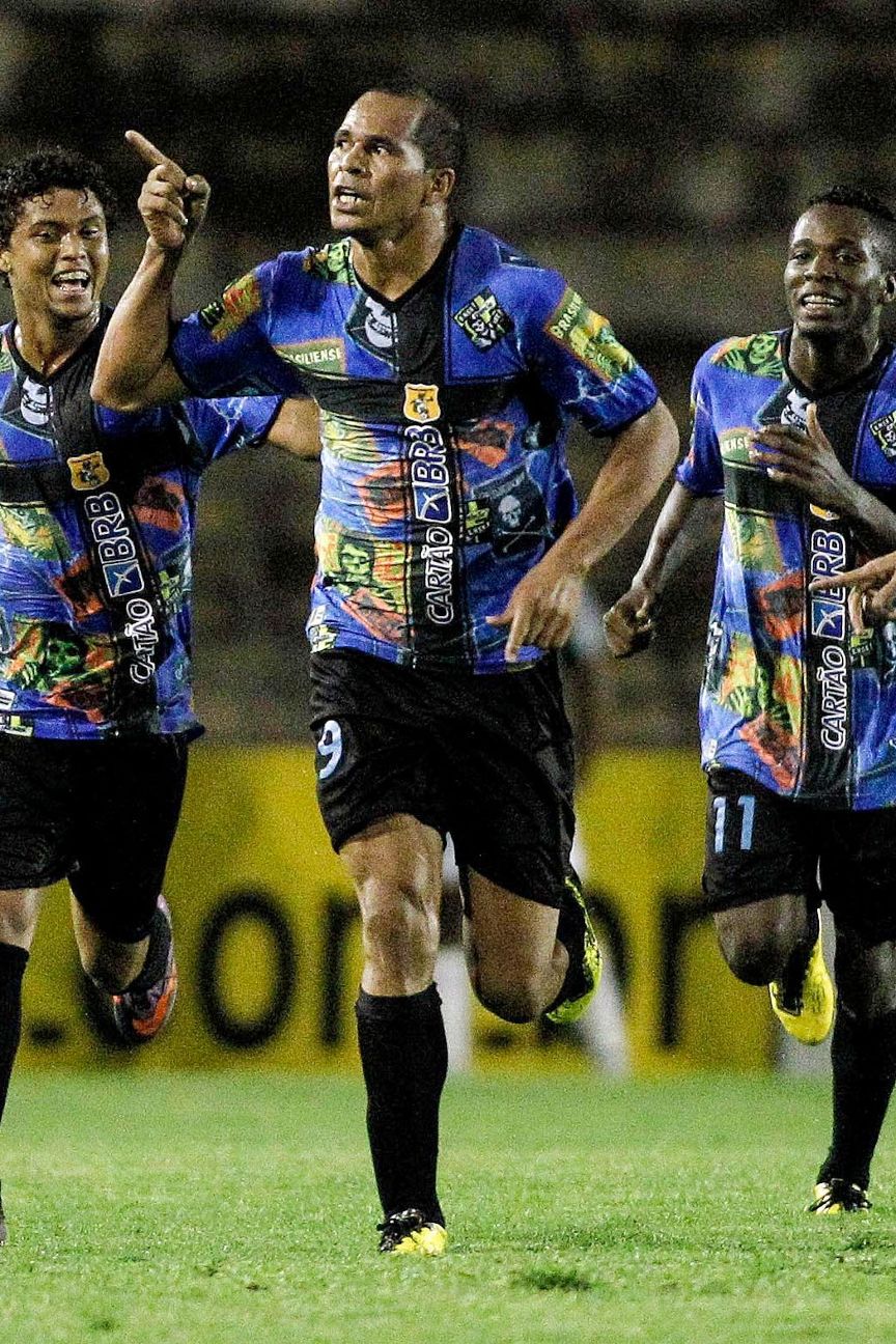 11. Brasiliense (home) 2010This horror of a shirt from Brasiliense, a club from Brazil's capital, was released to commemorate International Rock 'N' Roll Day, itself created to mark the anniversary of Live Aid, the world-famous music benefit concert staged in 1985. Brasilia is Brazil's home of rock 'n' roll, hence why the club thought it appropriate to release this shirt complete with skull and crossbones and the logo of seminal punk group The Misfits. Which, come to think of it, is the one saving grace of this jersey.
10. Chelsea (away) 1994-96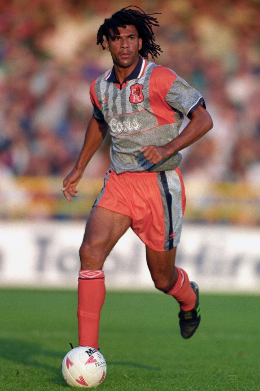 In the summer of 1995, Chelsea signing Ruud Gullit posed in his new club's home jersey worn over a long-sleeve office shirt, perhaps in an attempt to convince people that "doing a Gullit" (wearing football shirts over work attire) was the new "doing a Cantona" (turning up your collar). Funnily enough, it didn't catch on, and neither did this horrid grey-and-orange away shirt, which Gullit wore on his Chelsea debut in a preseason friendly at Gillingham. According to the club's kit man at the time, Terry Byrne, the idea behind the design was to avoid clashing with any opponent's home or away uniforms, eliminating the need for a third alternate kit. Well, it worked, although there is a reason no other team played in grey and orange.
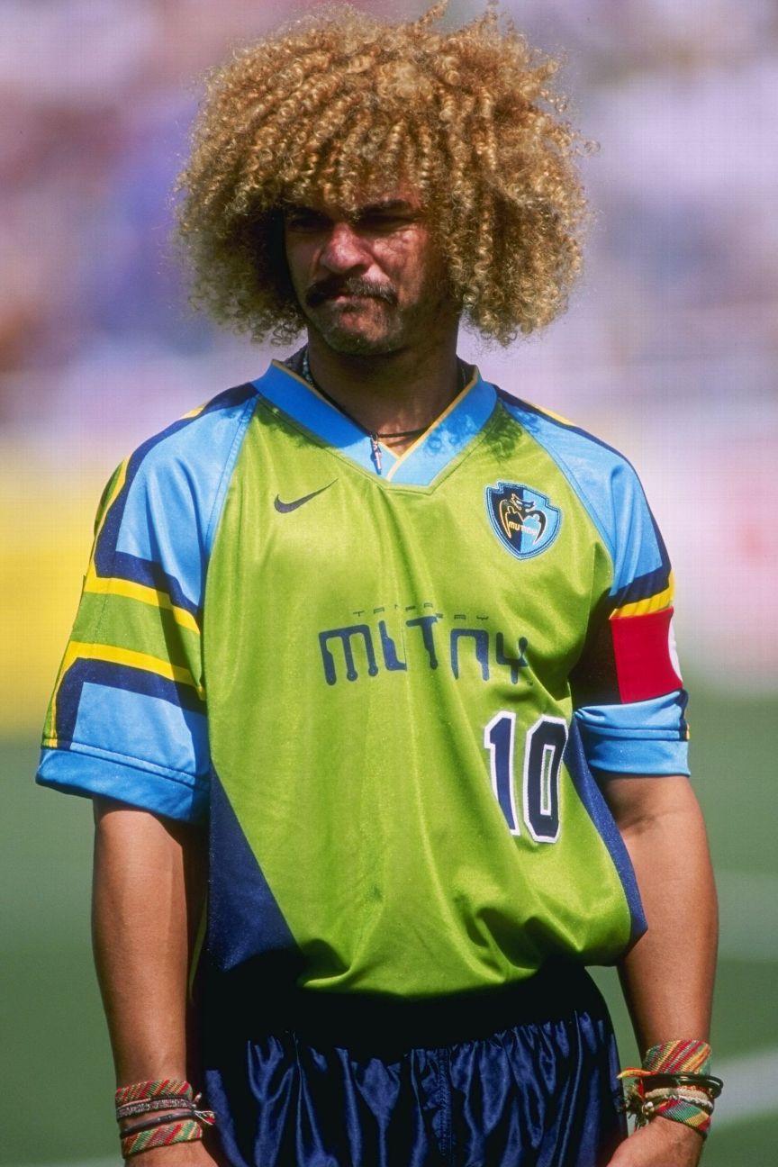 9. Tampa Bay Mutiny (home) 1996It was a real struggle to narrow down the selections from MLS' inaugural season; in fact, we recommend taking the time to check them all out. Tampa Bay Mutiny's first home kit stands out from that magical summer, though. The base colour has been variously described as lime green, chlorophyll green and vomit green -- all apt. The club's branding was influenced by a video game aesthetic, which is why the lettering across the front is straight out of Space Invaders. The Mutiny, led by Colombia's star of USA '94, Carlos Valderrama, won the Eastern Conference and MLS Supporters' Shield in their first season, but they never reached those heights again and eventually dissolved in 2002.
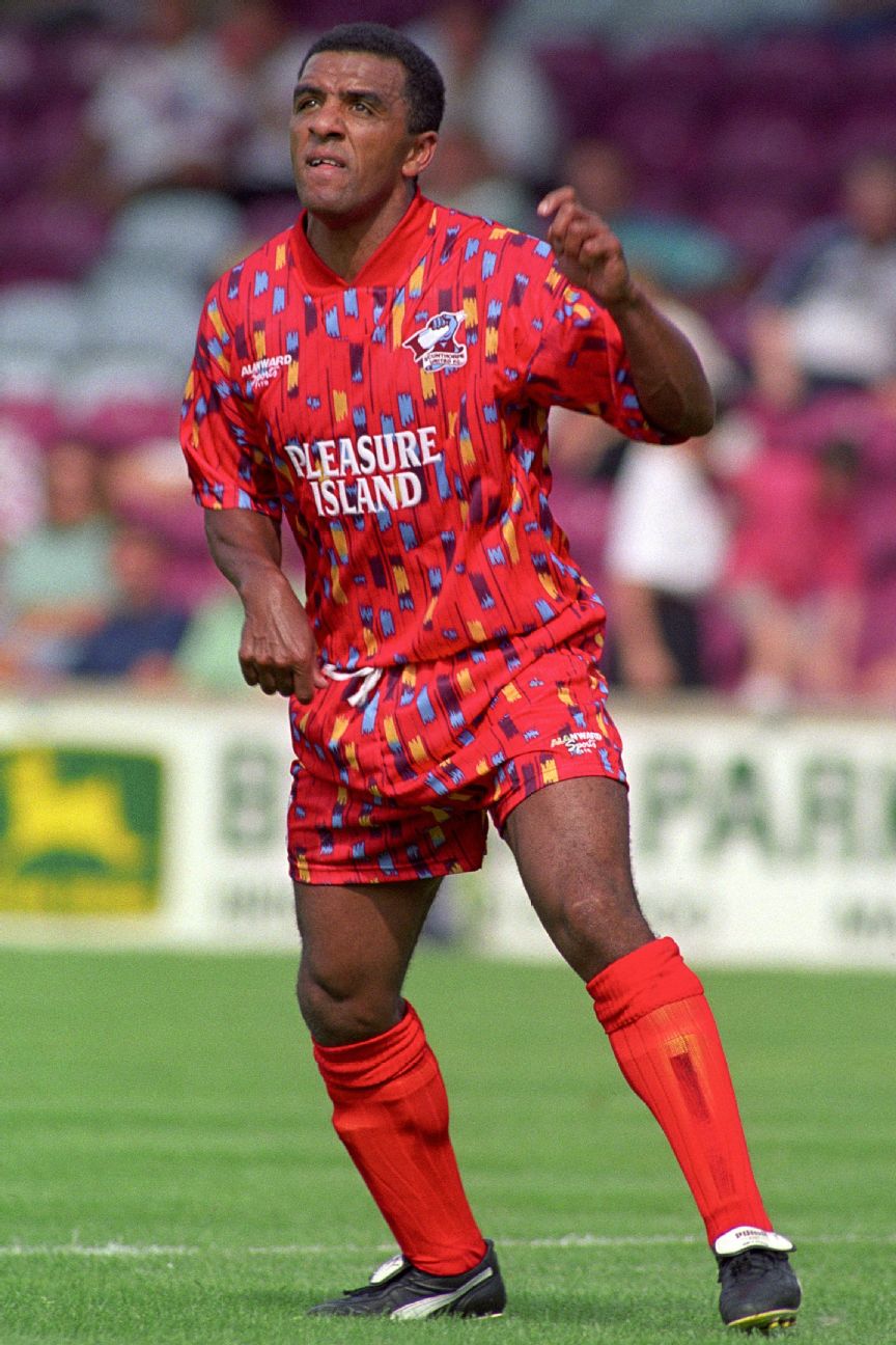 8. Scunthorpe United (away) 1994-95Lower-league English club Scunthorpe's sponsor at the time was the adventure park Pleasure Island, based in the nearby beach town of Cleethorpes, and this design is reminiscent of the results of riding a roller coaster after eating too much cotton candy. It's a shame that manufacturer Alan Ward Sports didn't extend the pattern to the socks, which would have really topped off this bold look.
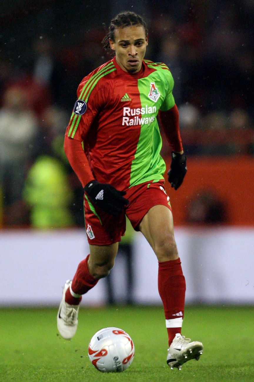 7. Lokomotiv Moscow (home) 2007-08If Lokomotiv Moscow's original colours were fluorescent green and London bus red, we could perhaps overlook this one, but they weren't; they were simply red and white. According to the club, the colour change in the early 2000s was inspired by fans who had taken to wearing red-and-green homemade scarves. This two-tone design is the worst Russian combo since t.A.T.u. Lokomotiv finished sixth in the season they sported this kit.
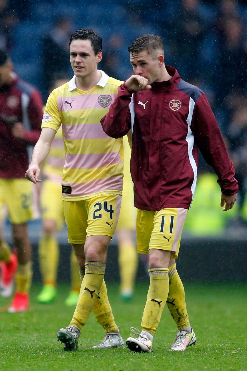 6. Hearts (away) 2016-17In July 2016, Hearts unveiled this away kit under the headline "Hearts reveal stunning new away kit," and they were right: people were stunned. This is a uniform that pays homage to the club's early days -- in particular the fifth Earl of Rosebery, Archibald Primrose, who was British prime minister from March 1894 to June 1895 as well as the first Earl of Midlothian and honorary president of both the Scottish Football Association and Hearts. His horse racing colours of rose and primrose yellow were adopted by the Scotland national team in 1900, so Hearts decided to do the same in 2016. But there's a big reason football kits don't look like this anymore: people didn't really take football that seriously. The goals didn't even have crossbars, for goodness' sake. Still, the earl's family remain Hearts fans to this day, and his great-great-great-grandson, Caspian Primrose, has been a mascot for the current side.
5. Barcelona (away) 2012-13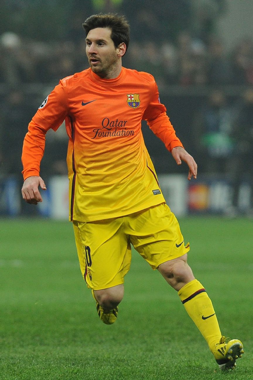 There was a time when Nike thought it would be a good idea to have GOAT candidate Lionel Messi suit up in what could be the anti-GOAT of kits. This concept looks as if it was inspired by a Nike executive staring for too long at a cocktail while on vacation in the Caribbean, or perhaps by the bowl of fruit salad at the hotel breakfast buffet. Nike claimed at the time of its release that Barcelona's uniform with an orange-and-yellow gradient effect was "in honour of the city's culture, art, style and architecture." That reasoning would carry more weight if the template hadn't been used for south London club Charlton Athletic's away kit two years later. Pep Guardiola actually left Barca shortly after this kit was unveiled. Coincidence?
4. Celtic (away) 1991-92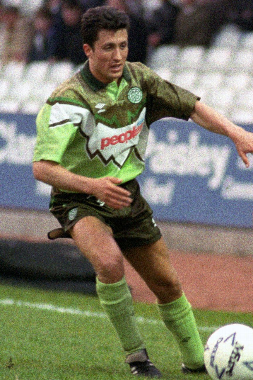 A terrible shirt for a terrible season. Celtic finished third in the Scottish Premier League (which is traditionally a two-team battle at the top between Celtic and Rangers) and were knocked out in the semifinals of the Scottish Cup and in the quarterfinals of the League Cup. Worse still, they exited the UEFA Cup 5-2 on aggregate at the hands of Swiss minnows Neuchatel Xamax. But the worst thing about the 1991-92 season was this kit. A lime green base, jagged-edged white middle section and what looks like a grass-stained patch across the chest and shoulders, Hoops fans still hate it to this day, partly because the sponsor has the blue and red of archrivals Rangers. One Celtic supporter who seems to quite like it is former Manchester United midfielder (and massive Hoops fan) Darren Fletcher, who picked one up last year, but he wasn't the only person to grab it. In February this year, Charlie Nicholas' match-worn No. 10 shirt was stolen from the National Football Museum. Luckily the item was swiftly returned, presumably because the thief saw how it looked in broad daylight.
3. Athletic Bilbao (home) 2004-05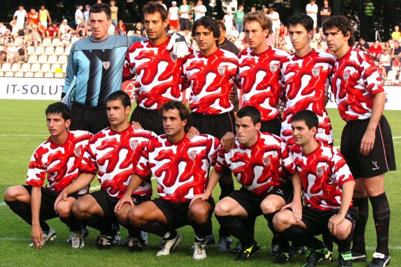 Respected Basque artist Dario Urzay designed this kit to commemorate the club's return to European competition and, according to the Guardian, it was inspired by the art in Bilbao's world-famous Guggenheim Museum. Rather than evoke the world of avant-garde art, it looks more like a close-up of some coral. The kit was worn during preseason in 2004 but was not seen again as Bilbao reverted to their traditional red-and-white stripes.
2. Manchester United (away) 1995-96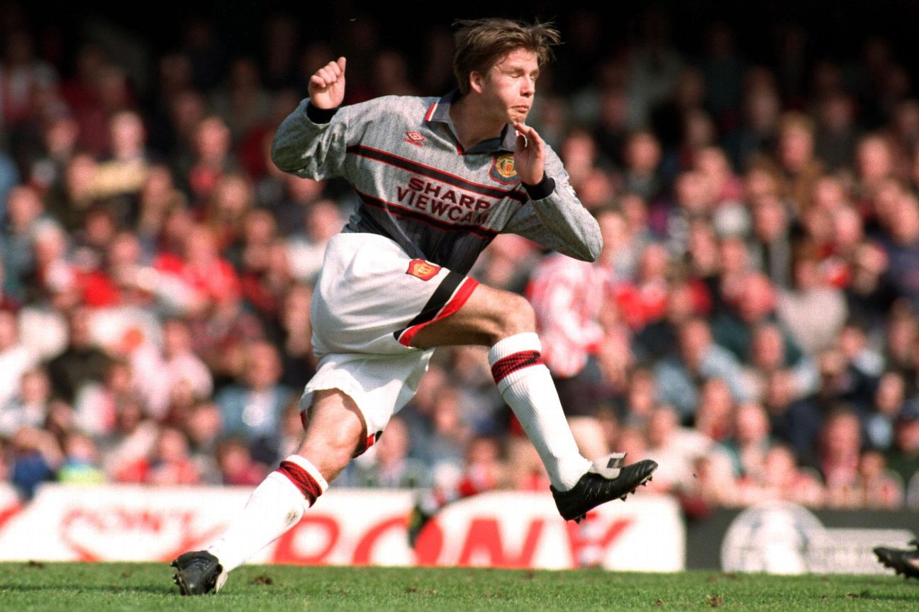 This drabbest of grey kits, which looks like the carpet of an insurance company's regional office, has gained legendary status after it was famously ditched at half-time in a match Manchester United were losing 3-0 at Southampton. That already makes it worthy of our list before we learned of United manager Sir Alex Ferguson's reasoning that the players couldn't see each other. There might be some truth to this incredible excuse as defender Gary Neville, who was playing that day, revealed years later that they actually had an eye coach: Professor Gail Stephenson from Liverpool University. Yes, really. "We used to do eye exercises before every game," Neville told Sky Sports earlier this year. "Sir Alex had been told by Gail that grey was the worst possible colour to spot players in with fans in the background. We had a full set of kit ready to put on at half-time." Neville's United teammate Lee Sharpe was not so sure it was down to the kit, telling the Guardian: "I'm not sure if any of the players mentioned the kit. Personally I felt that we were playing really poorly, and that we couldn't really blame anything or anyone but ourselves." United switched to their blue-and-white away kit at the break and "won" the second half 1-0, but the grey kit was binned immediately with a final record of no wins from four games played.
1. Colorado Caribous (away) 1978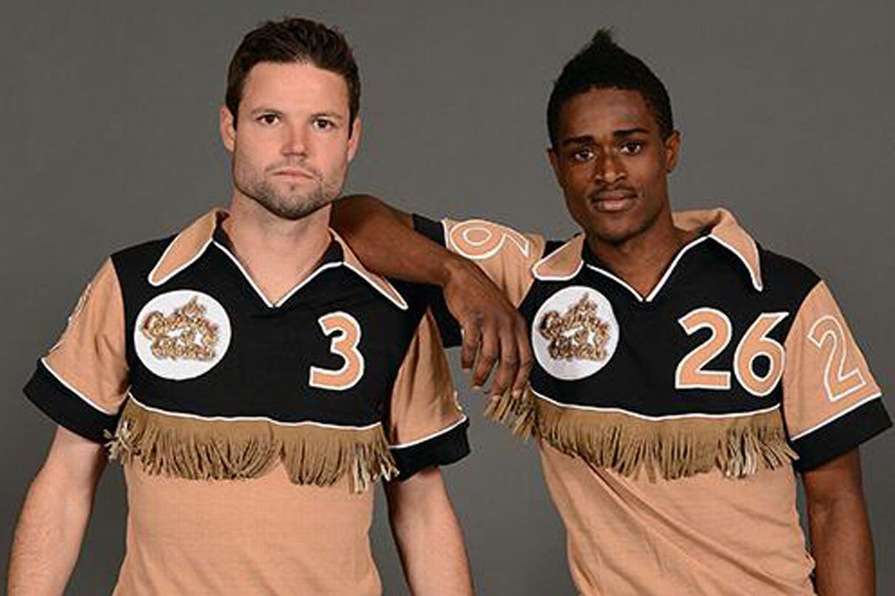 The Colorado Caribous may have been a short-lived franchise over 40 years ago, competing for one season in NASL in 1978, but they have a lasting legacy in the form of their extraordinary jerseys. The team's home and away kits both comprised a white, black, brown and tan colour scheme that featured tasseled faux-leather fringing across the chest and back. Even just writing that sentence feels weird. If the kit looks as if it came straight off the ranch, that's because it literally did. The design was the brainchild of Jim Guercio, owner of the famous Caribou Ranch, a recording studio in a converted barn on a property outside of Denver that was frequented by the likes of Elton John and Chicago. Guercio was a marketing genius who knew making the team look as ridiculous as possible would increase awareness. He got that bit right. The tassels in the original design were an incredible 10 inches long and would slap players in the face as they ran and jumped, as well as giving opponents something to yank on to gain an advantage. The club eventually cut them down to 2 inches, but still made the players wear giant Stetson hats and boots as they walked onto the pitch for games. "People were laughing their butts off," Guercio told MLSSoccer.com. The team's coaches didn't get away without it either, as they were made to wear the hats and cowboy boots on the sideline during games. The whole thing sounds like an April Fools' Day prank, so it's probably no surprise that on April 1, 2014, the Colorado Rapids tricked fans by announcing they would bring back the "world-famous" uniform. The fake announcement featured images taken by professional photographer Garrett Ellwood of players Drew Moor and Deshorn Brown wearing the tan away jersey, which is our pick as the worst of the two kits, but, really, we're just splitting faux-leather tassels. Additional writing and research by Tony Mabert
|